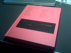
The book in question is the latest edition of Annual Review of Nuclear and Particle Science. I've always seen these on various library bookshelves over the years, and been given photocopies of various articles throughout the years (older issues seem to be online now, which wasn't the case last I checked!) And somehow the design feels very book-ish, sober red cover, with all of the contributors' names embossed in gold. Feels snazzy. Classy, even.

And then you open the thing up and it's all...in color, which is still relatively novel for scientific publishing due to the additional costs incurred by the journal publishers. So while most of us submit papers with color figures, a perusal through a physical copy of Physical Review C typically doesn't do much for the eyes. I'm actually surprised at myself that I am responding to some of these articles more for having downright elegant color and design choices - even a very clean, readable font (anyone recognize it?). That said, I now know that these choices may well come more from the Ann Rev staff than from the authors -- we had quite a few rounds with them during the final stages of our piece.
So anyway, here's a link to our piece on "Glauber Modeling in High Energy Nuclear Collisions" -- a year in the making, and another year to book form. And thanks again to my collaborators on this -- Mike, Klaus, and Steve.


1 comment:
hey, congratulations! Just catching up on your blog, sorry for the belatedness...but a book, a real book indeed - it's people like you who keep people like me (or places like the NYPL) in business...
Post a Comment